Product Design
Design System to Modernize Gallery Management Software
Project Summary
Gallery Systems is a leader in museum software solutions, trusted by over 800 clients in 31 countries, including world-renowned museums, cultural institutions, and private collectors. For nearly 40 years, Gallery Systems has been dedicated to enhancing the way museums manage and share their collections.
Based on product research, discovery, and software audit, I identified the need for a design system to reduce inconsistencies, streamline the development process, and enhance the overall user experience. The design system addressed the fragmented visual styles by providing a unified framework for all design elements, ensuring that all products adhere to a cohesive look and feel. The system created a single source of truth for design components, eliminating redundancy and confusion, and ultimately led to higher client satisfaction by delivering a more polished and professional product experience.
Responsibilities
Research & Discovery
Product Stategy
UX/UI Design
Prototype & Test
Timeline & Team
I completed the project in 4 months from start to finish as the sole product designer. I collaborated with a fully remote team, which included two product managers and several full-stack developers.
Results
Positive client feedback highlighted the improved visual consistency, reflecting a more professional and polished brand image. Developers reported that the redesigned login process was faster and easier to implement, as the design system provided clear and reusable components, streamlining the coding effort.
Problem
Gallery Systems, having operated with a development-led approach and without a product designer for many years, faced significant challenges due to the lack of a unified design system. This absence of cohesive design guidelines led to inconsistent visual styles, with different developers applying their own designs.
The result was a fragmented user experience, where clients felt the products appeared to be from different companies. Additionally, this disjointed visual identity caused inefficiencies and high friction in the development process, ultimately affecting team productivity and client satisfaction. A comprehensive design system in Figma was needed to standardize the visual language, streamline development, and enhance the overall user experience.
Process
I led the research and UX/UI design to develop and launch a comprehensive design system. This process involved identifying key inconsistencies across the products, advocating for the necessity of a design system, and integrating this system into the product roadmap.
I conducted a system-wide UI audit, identifying the need for a design system. This involved engaging stakeholders for insights, reviewing interfaces for inconsistencies, and cataloging UI components. These activities highlighted significant inefficiencies, underscoring the necessity for a unified design system to standardize components and improve the overall user experience.
Together with the project manager, I advocated for the value of a design system to the VP of Product and the lead UI developer. We identified an ideal portion of the product to redesign and apply the new design system, ensuring it aligned with our strategic goals. This initiative was then successfully integrated into the product roadmap to drive a cohesive and efficient development process.
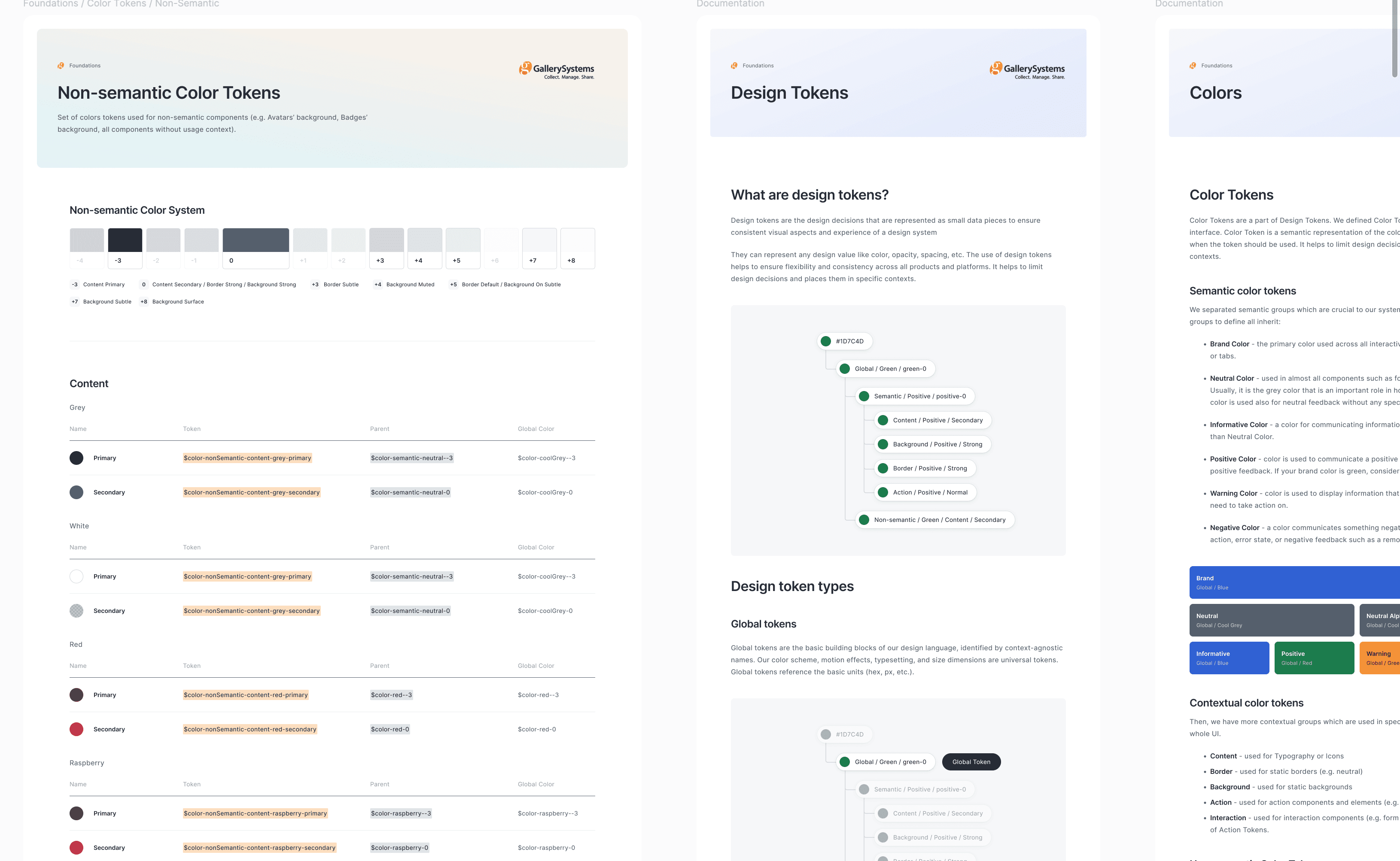
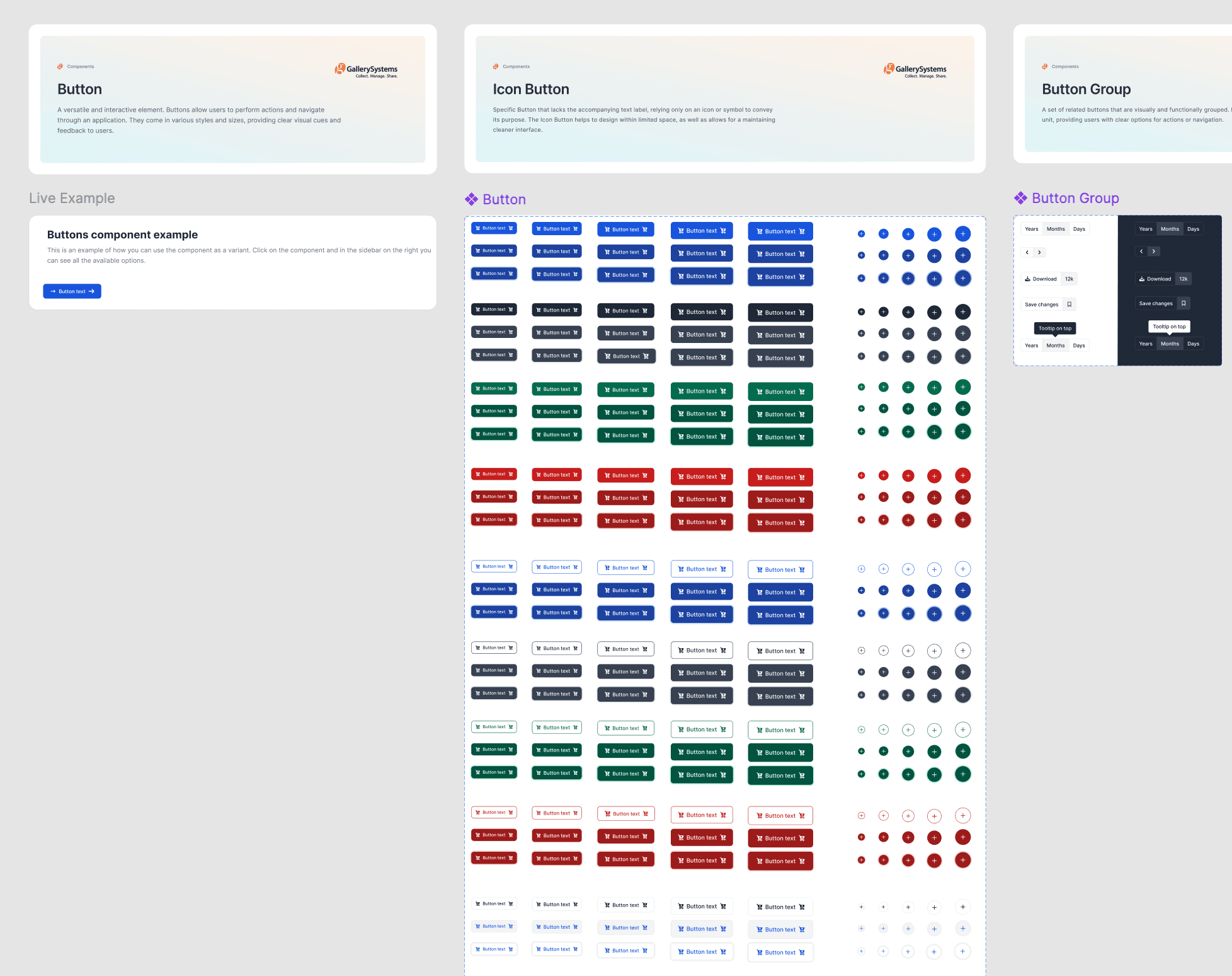
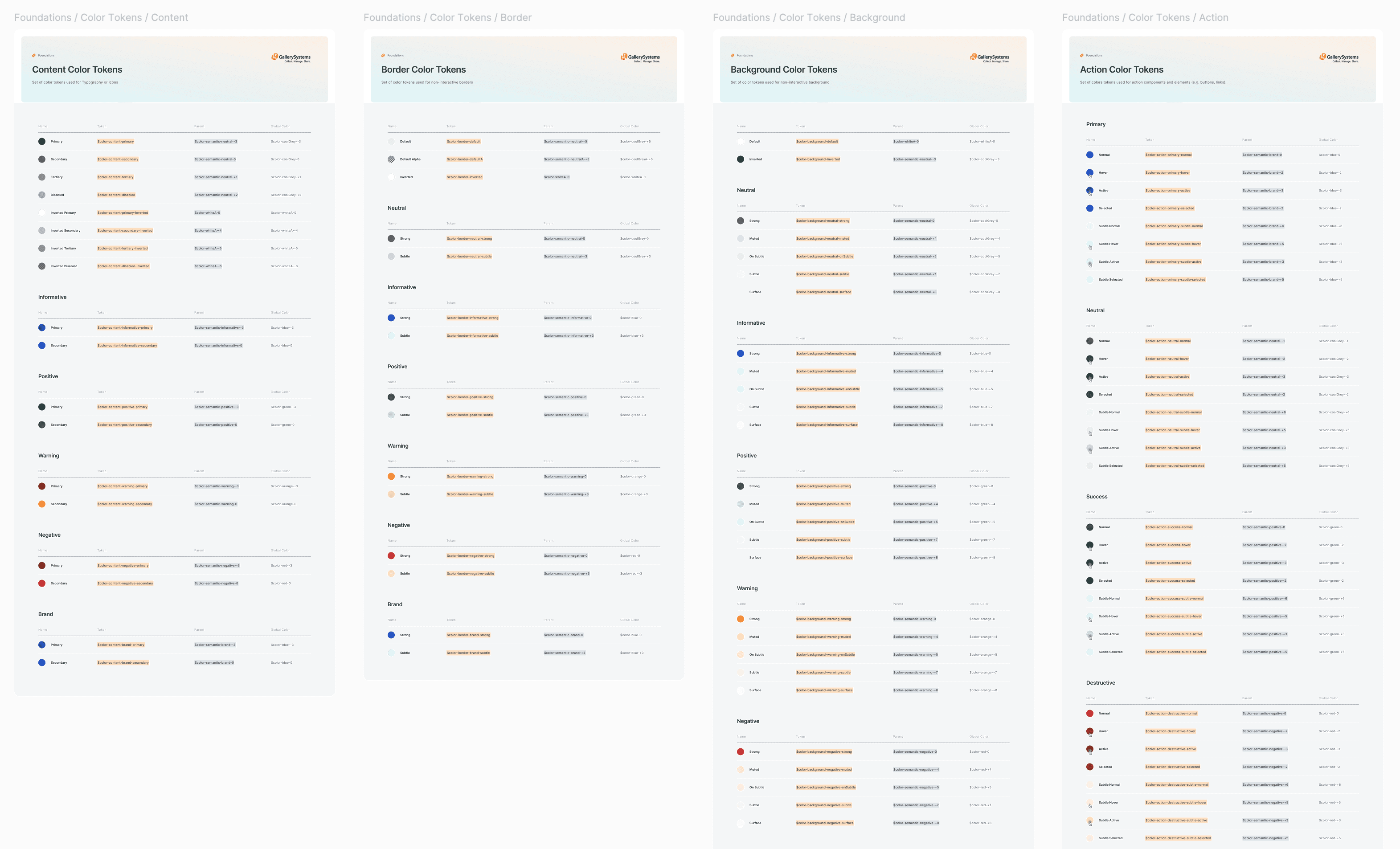
I created and maintain a robust Figma design system for Gallery Systems' four core products, featuring global styles and over 700 component variants. This involved defining typography, color schemes, spacing, grid systems, and creating a comprehensive library of reusable components such as buttons, forms, and modals. I ensured that all components were WCAG accessible.
I collaborated closely with product managers and developers to standardize all components and styles, conducting regular reviews and updates to maintain consistency. Using this design system, I completed the UX and UI design for the login redesign. Following this integration, I conducted thorough component stress testing and prototype testing to ensure that the login redesign met our requirements and performance standards.
Research
Planned and conducted 6 remote interviews with key stakeholders, followed by a system-wide UI audit.
Stakeholder's from Product & Service Departments
SAMPLE QUESTIONS
What are the most common pain points or usability issues reported by users across our current products?
What features or components do you believe are most critical to standardize across all products to enhance user experience and visual consistency?
How can we improve the collaboration and workflow between design, QA and development teams?
Through the system-wide audit, I discovered:
Component redundancy: feature-by-feature component creation
No style system: 100's of unnecessary style
No component source of truth: disjointed experience
Lower team productivity and high friction delivery process: loss revenue and motivation
Product Strategy
The product team was set up for feature delivery, meaning there was no direct systems work on the roadmap. To move Forward with the project, we needed to get buy-in from the VP of product and create space on the roadmap for the design system. I started by defining a mission to align the team woard a common goal.
The Mission Statement
Enabling the product team to support complex features and deliver superior customer value.
Understanding Workflow Frustrations
I met with our team to understand frustrations with the current workflow:
I found that there was a lack of alignment between developers as to what was the comment source of truth
Developers were working in isolation, resulting in more interface inconsistencies.
Advocating for the value of design systems
Clarifying the differnce between feature work, systems work, and their respective benefits.
Integrating the design system into an upcoming project was our first priority.
In collaboration with the product manager, I identified the login flow project as being the most suitable opportunity, as a complete overhaul of the UI was planned
This enabled us to build the MVP design system around form requirements and use that project as a testing ground for new components, patterns and styles
Collaborating with the lead engineer and project manager to map. phases for design and build process. The desig nand build portion of the project were oriented around three phases:
Definition (2 weeks)
Design (4 weeks)
Integration (4 weeks)
I defined the structure of the design system:
Foundations
Color Styles
Typography
Spacing
Grid Systems
Iconography
Elevation
Tokens & Variables
Components
Atoms
Molecules
Organisisms
Templates
Patterns
UI Patterns
Data Visualization
Guidelines
Usage Guidelines
Brand Guidlines
Accessibility
Documentation
Versioning
Contribution Guidlines
Code Integration
UX / UI Design
Collaboration with the wider product team to ensure a scaleable, accessible system.
Mapping flows to ensure an intuitive login experience for our multi-product platform.
Impacting over 8,000 users in more than 31 countries worldwide by integrating new component set and styles.
Prototype, Test & Iterate
To address the inconsistencies in the user experience, I began by creating a high-fidelity prototype of the new login flow using the established design system in Figma. The prototype incorporated all standardized components, global styles, and accessibility features to ensure a cohesive and user-friendly experience.
Engaging with stakeholders early in the design process was crucial for gathering feedback and ensuring alignment with business goals.
Stakeholder Review Sessions: Conducted review sessions with product managers, the VP of Product, and other key stakeholders. Presented the prototype and walked them through the user flow.
Feedback Collection: Collected feedback on usability, visual design, and alignment with the overall product vision. Documented all feedback for iterative improvements.
Consensus Building: Ensured all stakeholders were aligned on the direction of the design and any proposed changes before moving forward.
PROTOTYPE: EARLY IDEATION AND FEEDBACK COLLECTION
PROTOTYPE: 2ND VERSION
Collaboration with developers and QA members was essential to ensure the feasibility of the design and to identify potential issues early on.
Developer Walkthroughs: Conducted detailed walkthroughs of the prototype with frontend and backend developers. Discussed technical feasibility and gathered feedback on potential implementation challenges.
Stress Testing: Conducted thorough stress testing with the design team to ensure components meet platform-wide needs.
Integration Testing: Worked closely with developers during the integration of the design system into the actual product. Ensured that all components functioned as expected within the codebase.
QA Testing: Engaged QA members, ensuring quality output.
Outcomes & Lessons
Standardized design-dev workflow, drove a 48% reduction in component variations and unified the login experience.
BEFORE & AFTER
Defining metrics to quantify sucess and evaluate design system outcomes.
Ongoing evaluation of metrics fosters a culture of continuous improvement. Regularly reviewing the metrics helps in identifying new opportunities for enhancement and adaptation, ensuring that the design system evolves with changing needs and technologies .
Ongoing evaluation of metrics fosters a culture of continuous improvement. Regularly reviewing the metrics helps in identifying new opportunities for enhancement and adaptation, ensuring that the design system evolves with changing needs and technologies .
Key Outcomes & Results
Improved Consistency: Achieved a cohesive look and feel across all four core products, enhancing the overall brand perception and user experience.
Increased Efficiency: Reduced the time required for design and development by providing standardized components and guidelines, leading to faster implementation of new features.
Enhanced Accessibility: Ensured all components met WCAG guidelines, improving accessibility for users with disabilities and complying with industry standards.
What I Learned
The Importance of Collaboration:Close collaboration with product managers, developers, and QA members helped unify the team and gain buy-in, ensuring that potential issues were identified early and the feasibility of the design was maintained.
Stakeholder Engagement: Regular engagement with stakeholders helped build consensus, gather valuable insights, and ensure the design system aligned with business goals and user needs.
Measuring Success: Metrics for a design system and systems work can vary slightly, focusing on aspects such as time savings, consistency, user satisfaction, and adoption rates.
MORE CASE STUDIES
I saw an opportunity to reduce custom donation form development costs, and increase donation revenue by providing a first-class donation form product…and it worked!


