User Experience & Product Design
Crafting a Seamless Giving Experiences

Project Summary
Charity Dynamics is a leading provider of fundraising digital products and services. Our company noticed an interesting trend: clients were struggling with their default donation forms, leading to high costs and long timelines for customization.
Based on research and usability studies, we created an optimized, customizable donation form that aligns with industry best practices and saved our clients time and money, while significantly enhancing the user experience of their donation forms.
Responsibilities
Research & Discovery
UX / UI Design
Prototype & User Testing
Timeline & Team
12 weeks start to finish as the sole UX designer. Worked with a fully remote team, including a project manager, development manager and fundraising strategist.
Results
We were able to launch a new donation form for a client in half the time and with a 60% saving to our client. In the first 2 months after launch, clients reported a significant increase in donation revenue.


Problem
There is a pressing need for an optimized, Luminate Online donation form solution that can be quickly implemented and tailored to individual client branding, while also incorporating best practices in donation form usability.
By leveraging industry-standard best practices and conducting comprehensive research, we can create a productized donation form for Luminate Online. This form will allow clients to easily customize their branding and style, significantly reducing both the cost and time associated with traditional redesigns. Our approach aims to drive engagement, streamline the donation process, and ultimately boost donation revenues for our clients.
Process
I led the research and UX/UI design to launch the new productized donation form and collaborated closely with a fundraising strategist and 2 developers.
Planned and conducted 10 remote interviews with customer service agents and key stakeholders. Completed a competitor analysis, which included 5 remote moderated usability tests with top competitor donation forms.
Identified and prioritized the critical features for the new donation form. Collaborated with the development team to ensure the identified features and functionality could be implemented efficiently.
Mapped and designed key user flows based on the identified primary donor personas.
Collaborated with designers to create intuitive user interfaces and interactive prototypes. Iteratively refined designs based on user feedback to enhance usability and visual appeal.
Research
Planned and conducted 10 remote interviews with customer service agents and key stakeholders. Completed a competitor analysis, which included 5 remote moderated usability tests with top competitor donation forms.
4 Customer Service Agents
SAMPLE QUESTIONS
Have you noticed any patterns in the types of errors or support requests related to the donation process?
Are there specific steps in the donation process where donors frequently encounter difficulty on the form?
4 Client Stakeholders & 2 Internal Managers
SAMPLE QUESTIONS
Can you share any feedback you've received from donors or internal teams about the current donation form? We're interested in hearing all types of feedback, whether positive, negative, or neutral.
Are there any features or enhancements you believe would significantly improve the donor experience?
5 Users Who Have Placed A Donation
SAMPLE TASK
You want to make a donation of $100 in memory of a loved one. Go through the process of dedicating the donation and complete the transaction.
Tell me a little more about your experience. How do you feel that went? Is it what you expected?


Based on the research, I focused on two primary users of the donation form:

Product Strategy
I concluded that three key product requirements would eliminate existing friction for donors and make the donation form both scope and cost-efficient for clients and our development team.
Customization
Clients needed the ability to easily brand and style the forms to match their needs, ensuring a personalized experience.
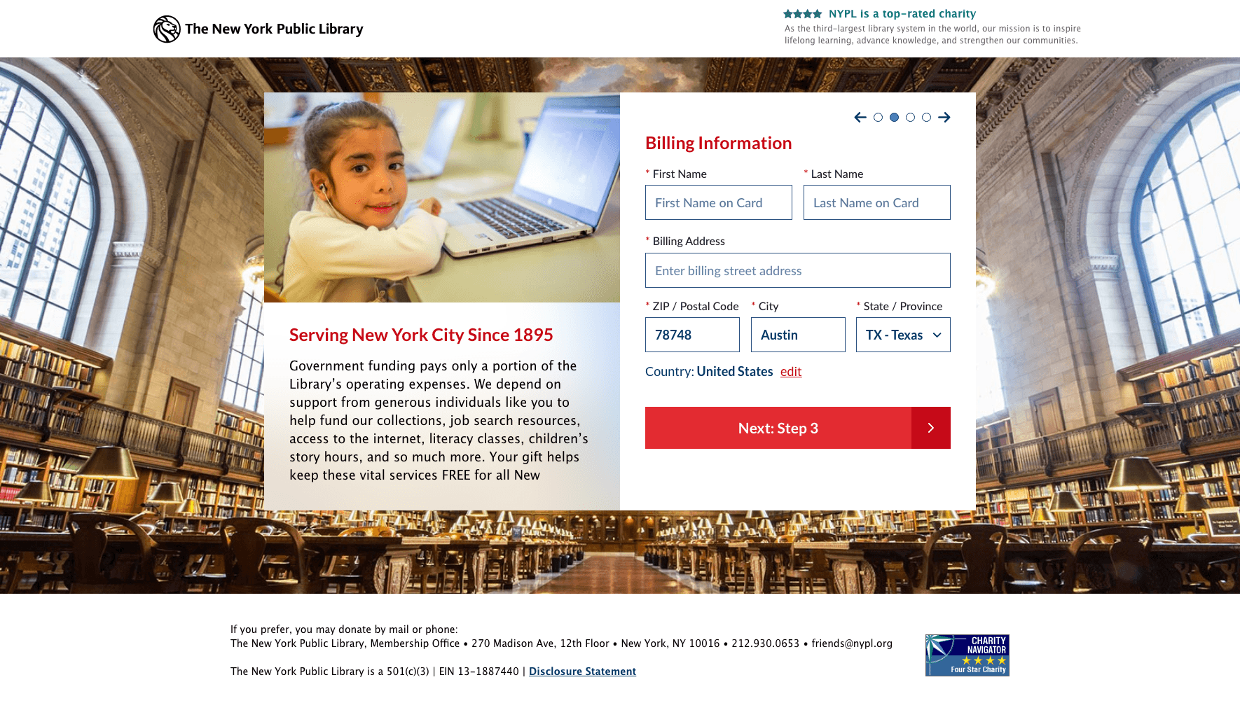
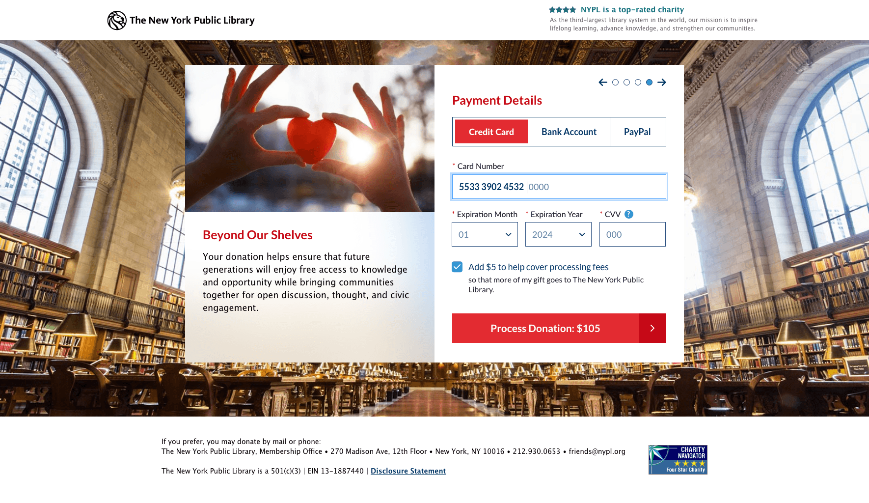
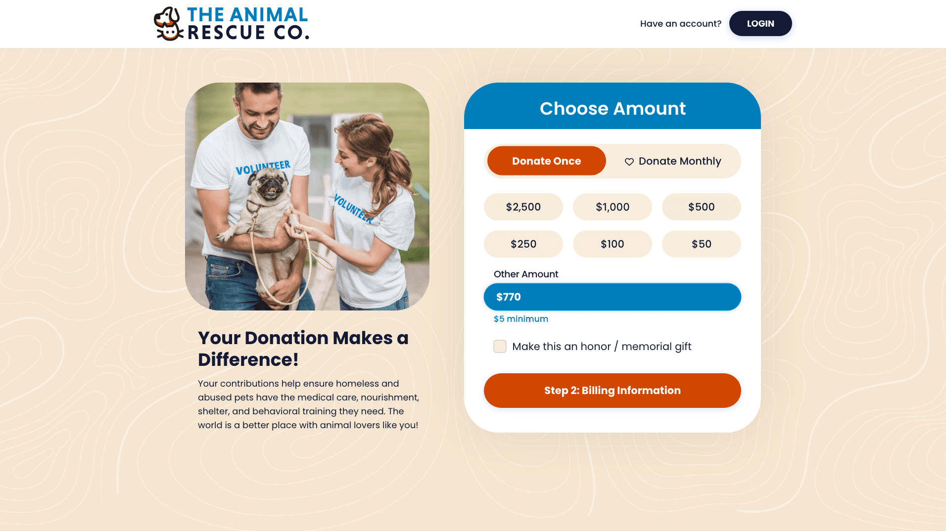
Multi-Step Donation Form
Implementing a multi-step donation form is essential to guide donors through the process in smaller, manageable steps, enhancing the overall user experience and reducing abandonment rates.
Reusable Code
Developers required modular and reusable code to efficiently implement and replicate the donation form across various client websites, reducing development time and costs.

Experience Design
First, I mapped out the experience for new donors making a one-time donation.

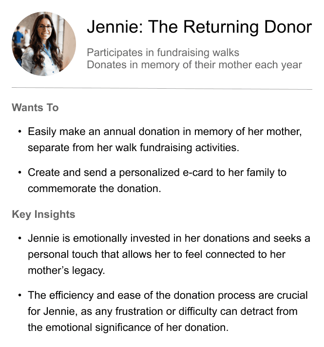
Next, I mapped out the experience for someone intending to place a donation in memory of a loved one.

A critical dependency for the donation form usability was implementing effective error handling to ensure donors could easily identify and correct mistakes throughout the multi-step process.
Real-Time Validation: Implemented real-time validation for each form field, providing immediate feedback to donors about any errors or missing information, thus preventing the accumulation of errors and reducing frustration.
Clear Error Messages: Designed clear and concise error messages that are contextually relevant, guiding donors on how to correct their mistakes without interrupting their flow or causing confusion.

Devon, the new donor, learns about the impact of his donation and quickly completes the process without encountering any errors!
Jennie, the returning donor, is able to create an e-card to send to her family, honoring her donation in memory of a loved one.

Prototype, Test & Iterate
After prototyping, I conducted 5 additional usability tests, followed by A/B testing with the new multi-step donation form and a visually similar form presented as one long form.
Usability testing with the prototype revealed that presenting the transaction fee and donation destination selection together in a single step created an unnecessary extra step and delay for users. A/B testing showed that these options were best received when combined with the payment details.
" Hum, if I change the donation destination does the transaction fee change? No, okay, I'm not sure why they are grouped together in their own step."
- Usability testing participant


My recommendation was a sucess: 100% of the users preferred the
multi-stepped form during A/B testing!
" Oh ya, it's much easier to complete the form when I'm not staring at the entire from at once. That (long) form is overwhelming to look at."
- A/B testing participant
Outcomes & Lessons
Donors can complete the form in under 5 minutes instead of 16 minutes!
By reducing the cognitive load, the multi-step form enables donors to make quicker selections with fewer errors, streamlining the donation process.

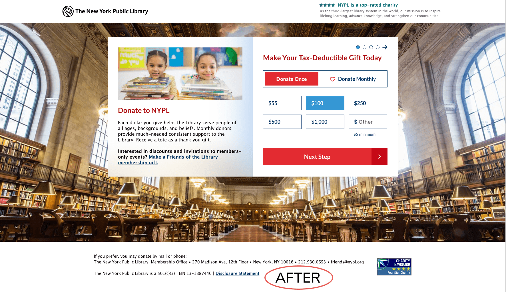
BEFORE & AFTER
The new donation form is providing a faster donation experience with a decrease in form abandonment.
Charity Dynamics development team is able to launch the new form in half the time saving their clients time and money.
Key Outcomes & Results
User Feedback: Usability testing and A/B testing showed that donors preferred the new multi-step format, with positive feedback highlighting the ease of use and improved navigation.
Cost and Time Efficiency: The modular and reusable code design allowed for quicker implementation and reduced costs for clients, making the donation form more accessible to various non-profits.
Reduced Cognitive Load: Reducing the cognitive load allowed donors to complete the form more effeciently, resulting in quicker form completion, reduced abandonment rates, and fewer errors.
What I Learned
Customer Service Insights: Customer service is a crucial lens for insight and ideas about potential opportunities and optimizations in any product experience.
Breaking Down Complex Processes: Breaking down complex processes into smaller, manageable steps, like the stepped donation form, significantly improves user experience and reduces cognitive load.
Utilizing Multiple Research and Testing Methods: Understanding and prioritizing user needs through a combination of detailed research and usability testing methods can be key to a user-centered design.